For notable indication to your data you can define a color range, which can be expressed through a graphical widget and Incentives and performance screens, using a few easy steps:
- First, you need to add the feature to your subject lines through the user permissions:
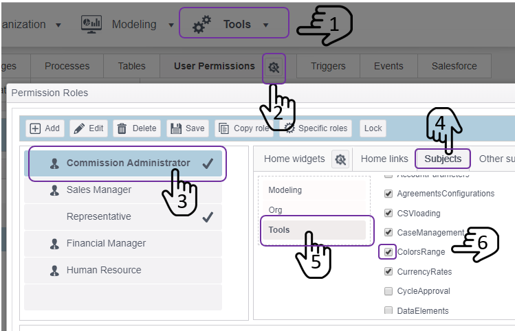
- You can choose by role to whom will be access to define color sets
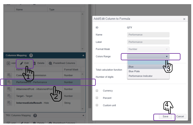
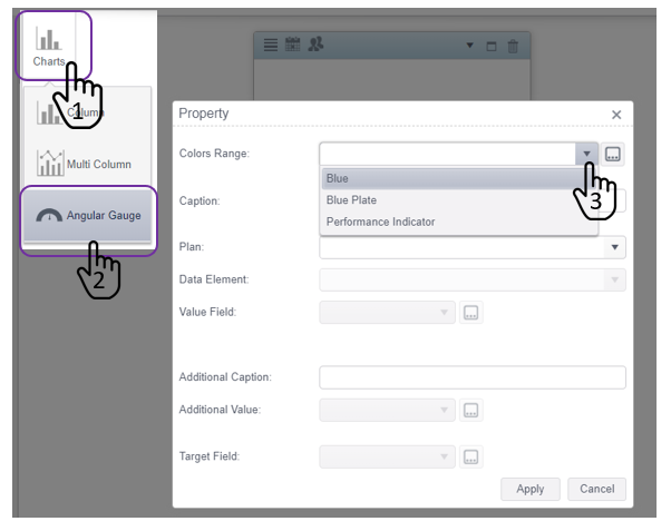
- Add a new color range by clicking
 -> set a range name and definition to this color range:
Press  to add range or
 ![]() to delete them:
to delete them:

- Use the color set at the different section:
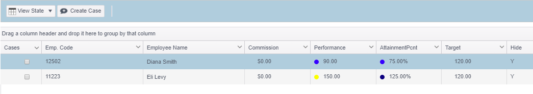
A.Presenting colorful indications on the JOOPY information screens by setting the plan formula body:
The outcome:
B. Use the color set in a graphical widget:
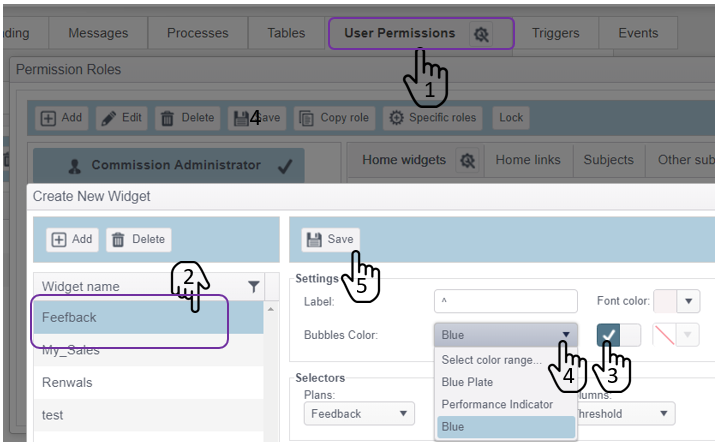
The outcome:
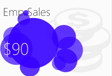
C. Or at the Angular Gauge, on the dashboards reporting tool:
The outcome:

Comments